

It was once said that the more symmetrical a face was, the more beautiful it looked. In fact, there is no such thing as a perfectly symmetrical face. If there happened to be one, it would not be beautiful, it would be odd. When the animators for the original Toy Story created the characters, they were created perfectly symmetric and it worked because they were toys, not humans. Because they were plastic inanimate objects come to life, we could subconsciously accept that perfection. We examine human faces all the time and are used to the slight differences from one side of the face to the other. The animated child in Toy Story was also perfectly symmetrical and seemed strange to the audience –– something was off. Now computer animation has expanded technologically so as to make humans so humanlike, or rather slightly asymmetrical, they now resemble people as we are — imperfect.
My new project, in Davenport, FL, was also very asymmetrical, but with no character or balance. Balance is even more important than symmetry for beauty. A house façade with balance displays positive curb appeal. This can be achieved with just a few well-placed plants. Sometimes, however, you need to go a little further like I did with this house.
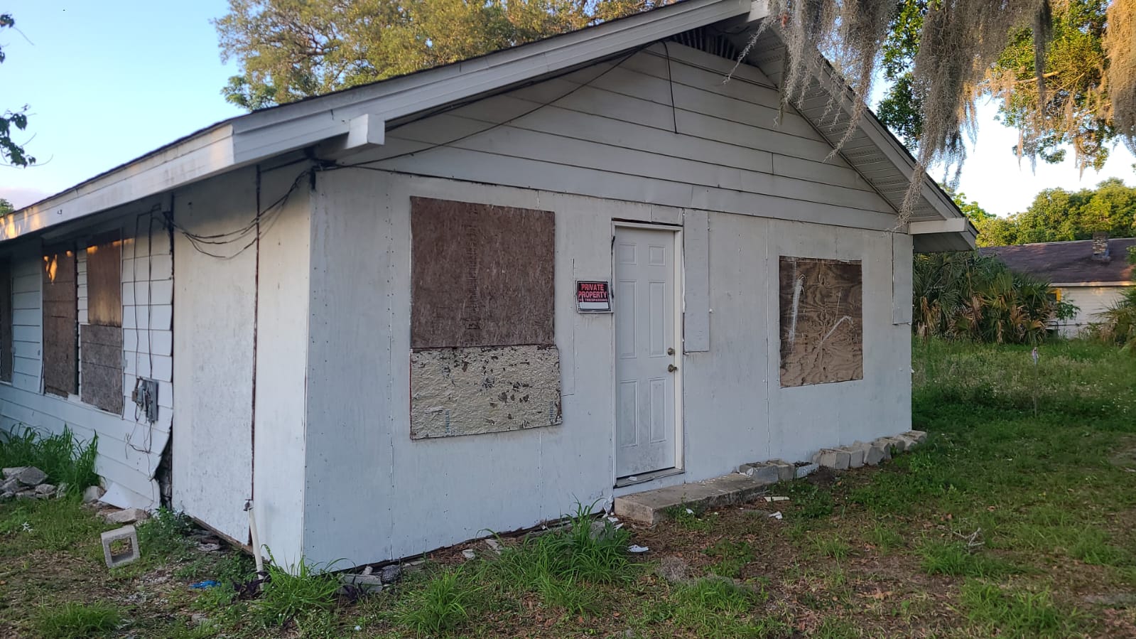
When I looked at this house, it appeared to me like a small rundown shack: the narrow entrance door left of center with a small window opening to the left of that. On the right side was a large square opening for a window. No windows existed in this shack; these were boarded up window openings, yet if finished with windows as it was, that house would be very odd and unattractive. It also had a small footprint, that from the front, you’d imagine it small. (And it was very small.)
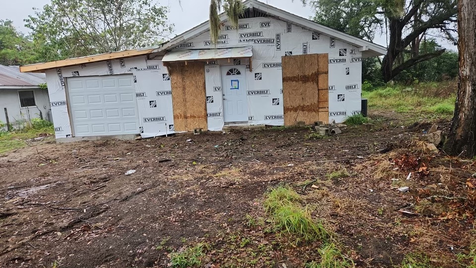
The front of the home needed more umph! It needed expansion. We added on the left side of the house since there was land to spare. This became a one car garage and utility/flex room behind it under air and heat enlarging the home to 1100 sq ft another 192 sq ft for a garage. This gave the façade more presence, but we still had the awkward balance with lack of character.
From the start I wondered how I’d pull this one together and then I thought about symmetry. The original house had a simple gable roof and the door seemingly should have been centered.
I found an archived photo of the home, and as I thought, it was, but that was changed by the last owner who abandoned the renovation. He decided to frame the house right down the middle, causing the doorway to slip off to the left and because of costs we kept a lot of the framing including the centered wall.
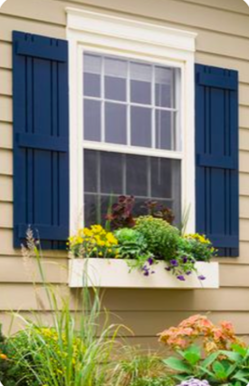
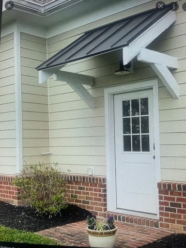
It dawned on me suddenly that the answer was to balance the weight of the new garage on the left to an emphasis of the large window on the right, making a new center with a simple country portico tying the doorway and smaller window as one unit. Continuing with the charming country feel of the facade, the large window would be detailed with shutters and a flower window box. Voila! Balance, charm, and asymmetry that works!

 Facebook
 X
X
 Pinterest
 Copy Link